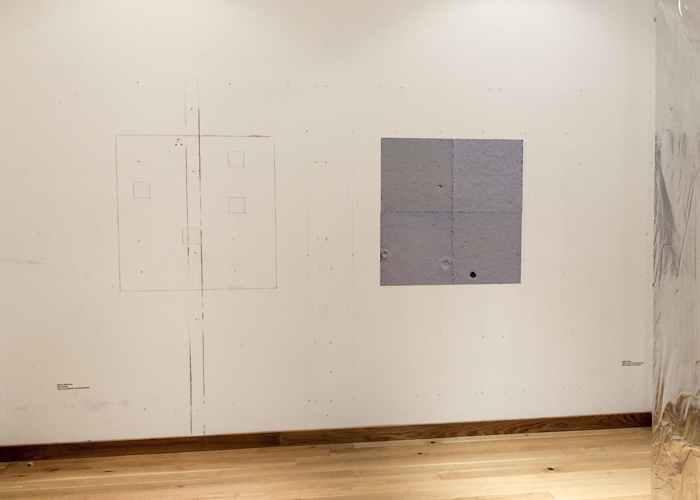
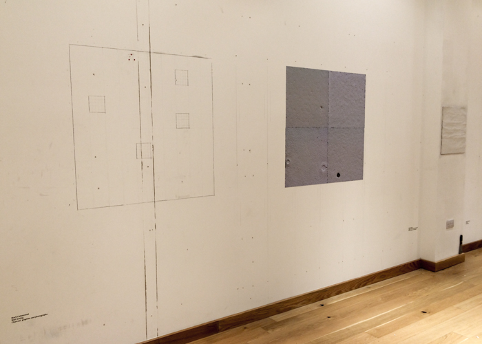
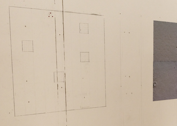
A site-specific installation as part of ‘The Manifesto of the Wall‘, Fringe Arts Bath 2015.
Museums, Art History, Art
Details:
")
")
")
Interviews with artists are often used as source material by art historians. But how reliable are those interviews? The provenance of them can be more complicated than it might appear at first. David Sylvester interviewed many artists, including Louise Nevelson. His interview with her in November 1963 was broadcast on the BBC, and a recording of that interview is held in the British Library’s archive.
The interview is most easily accessible in Sylvester’s book Interviews with American Artists, but the text printed there differs considerably from the broadcast interview. Not only was much of the broadcast cut from the … continue reading
A found painting.
“The daily papers talk of everything except the daily. The papers annoy me, they teach me nothing”. Georges Perec wrote these words in 1973, but they seem just as relevant today. The froth of news, with its focus on dramatic events and a scorning of the ordinary, could not have been further removed from Perec’s own preoccupations. He focussed on the stuff of everyday life – the comings and goings of people in the street, the way a flock of pigeons flies around a city square, the objects on his work table. Things that many might overlook – what Perec sometimes referred to as the ‘infra-ordinary’ – were for him the main interest.
In that respect, his concerns overlap with those of the Japanese artist On Kawara. Kawara focussed on time, location, movement and the simple fact of being alive. … continue reading
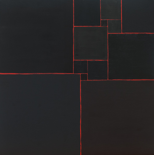
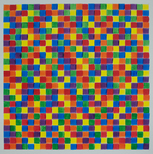
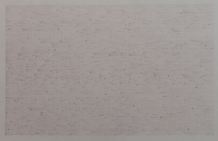
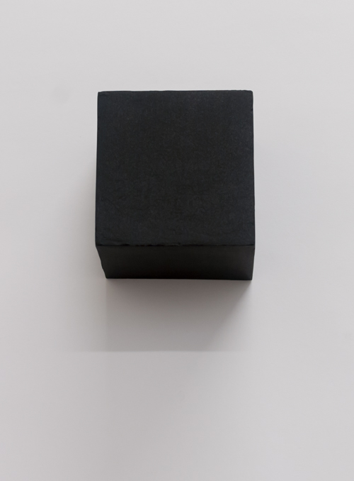
99 Black Squares (for Kasimir Malevich) used 99 out of 112 permutations of various combinations of black paints and mediums. The other 13 are used here, in an arrangement known as a Mrs Perkins Quilt.
Installation view:
It’s just one room, but what a room. Fifty years of work are condensed into what could stand as a mini retrospective of Frank Auerbach’s work.
The landscapes are mostly the familiar subjects of Primrose Hill and Camden Town: Mornington crescent, the passage to Auerbach’s studio. Early on in his career he spent much time drawing and painting building sites in appropriately earthy tones, and there is a good example here in Rebuilding the Empire Cinema Leicester Square, the framework gouged out of the thick paint. That thickness is one of the best known features of Auerbach’s painting and various heads of E.O.W., one his long-term sitters, sometimes appear to take this paint layering to extremes. In a typical pose, she looks down and to one side as if avoiding the artist’s scrutiny. Her brow is built up to a projecting ridge of paint that takes the image almost into the realm of relief sculpture. Another painting nearby exchanges the ochre tones for brighter colours and a great deal of white, the paint looking almost as if it was squeezed out of the tube directly onto the panel and gradually piled up to at least an inch above the surface. It takes a while for the eye to retrieve the image from the tangled skeins of paint, and once seen it appears as a surprisingly peaceful pose amidst the apparent turmoil of the surface.
The progression from earths to lighter colours, made possible by Auerbach’s improved finances, is mirrored in the landscapes. Later works from the 2000s are characterised by relatively thin paint and warm bright hues. A head of Auerbach’s wife Julia from the same period painted in similarly bright acrylics, an unusual medium for the artist, seems less successful, but most of the works here are compelling. The whole collection belonged to Lucian Freud and the friendship between the pair is attested to by a charming display of letters and cards from Auerbach. Small portraits and cartoons adorn the various messages and anyone with an interest in either artist might find a trip to this display worthwhile for these alone.
The Tate are showing all the works together before they are dispersed to various galleries around the country. It has been suggested that the Tate should keep the lot together in its own collection, but that would deprive other parts of the country of the possibility of seeing some wonderful painting. This display can only whet the appetite for the full retrospective coming to the Tate in 2015.
Walking through this engaging retrospective at the Tate is like seeing someone’s purpose come into focus and then slowly dissipate again. A slightly overloaded first room shows Malevich trying out various styles of his time including Impressionism, Fauvism and Symbolism. There are some radiant small tempera paintings in which he deals with Christian themes in a manner which recalls Indian miniature painting. A slightly lumpen manner of portraying Russian village life followed this before he got to grips with Cubism and Futurism at once, coming up with a style by turns reminiscent of Cubism and Léger. ‘Alogical painting’, the combining of various elements which made no sense, such as a cow and violin portrayed at widely differing scales in the same image, was one of the many ideas that seemed to fit with Malevich’s adaptation of synthetic cubism and its use of collage.
Alogical painting seemed to provide a stepping stone for Malevich to abandon representation altogether and begin what he called Suprematism. The best known Suprematist work is the stark Black Square, and although the original Black Square is too fragile to travel there are two later examples here, one of which crowns a partial reconstruction of the so-called ‘Last Exhibition of Futurist Painting 0.10’. This featured an array of Suprematist paintings, all using flatly painted geometric shapes in a wide variety of combinations. Only nine of those works are shown here, but it’s enough to bring the past to life. The placing of the Black Square in the upper corner of the room is often discussed in terms of that being the usual place for Russian icons in a home, but as the curators point out Vladimir Tatlin also placed some of his relief sculptures in the same position in another part of the same show. As they have found space for some works by Malevich’s colleague Olga Rozanova, it might have been good to see some of Tatlin’s work here too, to expand on the context of the exhibition.
Malevich had found his style and an intellectual justification for it. Declaring Suprematism to be the beginning of a new culture, he continued to paint in this manner until the early 1920s. Colour gave way to white on white canvases, and the dissolution of coloured form is made graphic in two paintings here which show coloured planes with their edges dissolving into white space.
For a time he gave up painting altogether and transferred his energies to architecture and teaching, represented here by reproductions of some his architectons, geometric plaster models of futuristic buildings, and a bewildering display of some of his large scale teaching diagrams. The catalogue translates the content of some of these, and translations would have been helpful in the exhibition itself.
After the exhilaration of witnessing Malevich’s invention of a new form of painting and architecture, the last two rooms of the show are something of a disappointment. In the late 1920s Malevich returned to figurative painting, firstly picking up a style he had tried 15 years earlier and depersonalising it in paintings such as the Sportsmen of 1930-1 which shows a row of faceless figures resembling crude mannequins. But then Malevich went further back, to imitating earlier styles of painting and even depicting himself as a kind of Florentine merchant. There are some signs of Suprematist style – boldly coloured geometric forms in some of the outfits, for example – and some of the paintings are signed with a black square, but it seems a sadly retrograde step for someone who had so boldly declared that figurative artists of the past were ‘counterfeiters’ of nature.
Tate Modern, London. 16th July – 26th October 2014