Serendipities of online community

The many-headed monster blog, run by a group of academic historians, has been publishing a series on the best way to build communities online. Under the tag #SchOnline, the posts have covered teaching, conferences, online meetings, and more.

As part of the series I wrote about the benefits of Twitter and blogs, based on some of my recent experiences of doing research online.

The whole series is well worth reading – the contents page is here: https://manyheadedmonster.wordpress.com/2020/07/22/schonline-scholarly-communities-online/

The first six months of a PhD

I’m almost halfway through the first year of a projected three-year PhD. The subject of my research is museums in the UK that have closed since 1960. I’ll be looking at why they closed and how those museums were valued by staff, visitors, and other interested parties.

The first part of a PhD is usually a literature review, which involves reading as much as possible that’s relevant to what I’m studying, and I’m in the thick of that at the moment. So far I’ve looked at around 90 books, articles, reports, and other publications. I make notes on what I read, and then write drafts to summarise the topics and questions that come up. That’s resulted in writing over 50,000 words of notes and drafts since October. Eventually, what I write at this stage will probably get boiled down into a chapter of the final PhD thesis.

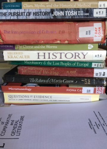
My work takes me to quite a few libraries. I’m based at Birkbeck, and I’ve also spent time in the libraries at nearby Senate House and SOAS, as well as the British Library and the rather beautiful National Art Library at the V&A. But mini-libraries can also develop on your desk while you work. Here’s a glimpse of what’s on my desk at the moment.

A pile of academic books and papers on a desk

Rachel Howard: At Sea

The display of Rachel Howard’s recent work at the Hastings branch of the Jerwood Gallery feels like a strangely divided affair, the paintings falling into two quite distinct groups. The more compelling set, smaller in scale, are mainly concerned with the materiality of paint. Surface qualities are to the fore, riven as they are with cracks, rivulets and delicate black hairlines. In Lean To an irregular grid is abraded, obscured or partly washed away by other layerings, while the grid in Sleepless is disrupted like rips in a net, the loosened lines clinging to one another in places like the fine strands of a broken web. These are subtle and evocative paintings, and although they sometimes invite readings as vast landscapes seen from the air, those readings are resisted by the variety of mark-making and subtle distortions of their largely monochromatic palettes. For one feature that gradually exerts pressure on you is the subtle use of bright fluorescent colours. In many works they bleed out at the edges of the canvas, as if one of the first layers to be applied in what appears to have been a lengthy painting process. But in other works, such as Fall, the fluorescence glows softly through the … continue reading

Frank Auerbach

It’s just one room, but what a room. Fifty years of work are condensed into what could stand as a mini retrospective of Frank Auerbach’s work.

The landscapes are mostly the familiar subjects of Primrose Hill and Camden Town: Mornington crescent, the passage to Auerbach’s studio. Early on in his career he spent much time drawing and painting building sites in appropriately earthy tones, and there is a good example here in Rebuilding the Empire Cinema Leicester Square, the framework gouged out of the thick paint. That thickness is one of the best known features of Auerbach’s painting and various heads of E.O.W., one his long-term sitters, sometimes appear to take this paint layering to extremes. In a typical pose, she looks down and to one side as if avoiding the artist’s scrutiny. Her brow is built up to a projecting ridge of paint that takes the image almost into the realm of relief sculpture. Another painting nearby exchanges the ochre tones for brighter colours and a great deal of white, the paint looking almost as if it was squeezed out of the tube directly onto the panel and gradually piled up to at least an inch above the surface. It takes a while for the eye to retrieve the image from the tangled skeins of paint, and once seen it appears as a surprisingly peaceful pose amidst the apparent turmoil of the surface.

The progression from earths to lighter colours, made possible by Auerbach’s improved finances, is mirrored in the landscapes. Later works from the 2000s are characterised by relatively thin paint and warm bright hues. A head of Auerbach’s wife Julia from the same period painted in similarly bright acrylics, an unusual medium for the artist, seems less successful, but most of the works here are compelling. The whole collection belonged to Lucian Freud and the friendship between the pair is attested to by a charming display of letters and cards from Auerbach. Small portraits and cartoons adorn the various messages and anyone with an interest in either artist might find a trip to this display worthwhile for these alone.

The Tate are showing all the works together before they are dispersed to various galleries around the country. It has been suggested that the Tate should keep the lot together in its own collection, but that would deprive other parts of the country of the possibility of seeing some wonderful painting. This display can only whet the appetite for the full retrospective coming to the Tate in 2015.

http://www.tate.org.uk/whats-on/tate-britain/display/bp-spotlight-frank-auerbach-paintings-and-drawings-lucian-freud-estate

Malevich

Walking through this engaging retrospective at the Tate is like seeing someone’s purpose come into focus and then slowly dissipate again. A slightly overloaded first room shows Malevich trying out various styles of his time including Impressionism, Fauvism and Symbolism. There are some radiant small tempera paintings in which he deals with Christian themes in a manner which recalls Indian miniature painting. A slightly lumpen manner of portraying Russian village life followed this before he got to grips with Cubism and Futurism at once, coming up with a style by turns reminiscent of Cubism and Léger. ‘Alogical painting’, the combining of various elements which made no sense, such as a cow and violin portrayed at widely differing scales in the same image, was one of the many ideas that seemed to fit with Malevich’s adaptation of synthetic cubism and its use of collage.

Alogical painting seemed to provide a stepping stone for Malevich to abandon representation altogether and begin what he called Suprematism. The best known Suprematist work is the stark Black Square, and although the original Black Square is too fragile to travel there are two later examples here, one of which crowns a partial reconstruction of the so-called ‘Last Exhibition of Futurist Painting 0.10’. This featured an array of Suprematist paintings, all using flatly painted geometric shapes in a wide variety of combinations. Only nine of those works are shown here, but it’s enough to bring the past to life. The placing of the Black Square in the upper corner of the room is often discussed in terms of that being the usual place for Russian icons in a home, but as the curators point out Vladimir Tatlin also placed some of his relief sculptures in the same position in another part of the same show. As they have found space for some works by Malevich’s colleague Olga Rozanova, it might have been good to see some of Tatlin’s work here too, to expand on the context of the exhibition.

Malevich had found his style and an intellectual justification for it. Declaring Suprematism to be the beginning of a new culture, he continued to paint in this manner until the early 1920s. Colour gave way to white on white canvases, and the dissolution of coloured form is made graphic in two paintings here which show coloured planes with their edges dissolving into white space.

For a time he gave up painting altogether and transferred his energies to architecture and teaching, represented here by reproductions of some his architectons, geometric plaster models of futuristic buildings, and a bewildering display of some of his large scale teaching diagrams. The catalogue translates the content of some of these, and translations would have been helpful in the exhibition itself.

After the exhilaration of witnessing Malevich’s invention of a new form of painting and architecture, the last two rooms of the show are something of a disappointment. In the late 1920s Malevich returned to figurative painting, firstly picking up a style he had tried 15 years earlier and depersonalising it in paintings such as the Sportsmen of 1930-1 which shows a row of faceless figures resembling crude mannequins. But then Malevich went further back, to imitating earlier styles of painting and even depicting himself as a kind of Florentine merchant. There are some signs of Suprematist style – boldly coloured geometric forms in some of the outfits, for example – and some of the paintings are signed with a black square, but it seems a sadly retrograde step for someone who had so boldly declared that figurative artists of the past were ‘counterfeiters’ of nature.

Tate Modern, London. 16th July – 26th October 2014

Alex Gene Morrison: Same As It Ever Was

The woods don’t look welcoming. Straying off the path, if you can find one, would probably lead you into trouble. The trees look dead, bare branches in the brownish murk. If we went in, what might we find?

A scary monster. Sharp fangs opened wide, eyeless and glossy black. Organic traceries or force fields surround his head. He might bite your hand off unless you can get away. You can almost hear him shrieking. There’s an apelike grey skull, an unearthly green light in its eyes. Is it dead, or somehow alive? An enormous hand is outspread in extreme close up. The hand of what – a man, an alien? The fingertips are coloured, the palm emblazoned with jagged purple symbols. Is it held up in a gesture of welcome, protection, or fear?

Those jagged lines keep coming. An acid yellow-green bolt cuts through a glossy slick of black paint. A black bolt glitters crisply against a matt grey surface. A shard of bright red, edges and point knife-sharp, sears across a cascading flurry of dark brush strokes. Is it rising, or descending? So many questions present themselves in this revel of ambiguity.

There is intense colour amidst the darkness, and it is very dark here. The mood is sombre, yet the work is vivid and dynamic. There’s an energy in the flow of brush marks, with some of the paint surfaces heavily worked. But there’s also an intense precision, a care for things being exactly so. Paint here is partly enjoyed for its own sake, as a liquid held in suspension, as a texture that you want to caress. A surface that glitters, shines and flickers before the eye.

In Arise, a totemic figure crowned with a lightning bolt fills the space before a field of something molten and glowing. Radiating darkness, emerging from an array of jagged shapes, it stands before us. Are we meant to worship, to cower? In the depths of the forest, we might have stumbled across a kind of dark ritual. If we could hear it, the noise would likely be deafening.

Charlie Smith, 336 Old Street, 2nd Floor, London EC1V 9DR.

http://charliesmithlondon.com/

Mondrian and Colour

At the end of this show there is a small display of commercial items (and no, I’m not referring to the gift shop). Photographs of models wearing angular dresses are shown next to a box of tissues and other goods. They are all adorned with Mondrian’s signature style. The black-lined grid on a white ground, punctuated by oblongs of bright primary colours, seemed to lend itself readily to commercial design and advertising. One can only imagine their originator’s despair had he been alive to see it.

The popular idea of Mondrian as a slightly austere creator of refined abstract paintings is reinforced by the photographs taken in his Paris and New York studios of a slim and rather donnish character wrapped in a dark double-breasted suit and wearing round rimmed glasses. If these images taken together comprise a Mondrian myth, then this show sets out to dismantle that myth by emphasising Mondrian’s development from his student days, mostly in terms of his use of colour. This is done, it turns out, almost at the expense of showing his more recognisable mature style. The colour of ‘Mondrian and Colour’ is not limited to his characteristic primaries of red, yellow and blue, but comprises the whole spectrum.

The show begins with numerous landscape sketches, many done plein-air, in naturalistic earthy tones. There’s a delicate study of a birch wood which makes clear what a skilled draughtsman Mondrian was. But fairly early on there are disruptions to a neatly linear narrative, exemplified by a sketch of a willow tree which is in huge contrast to other works in the section. Broad- brushed horizontal lines of orange and green lie beneath a dark silhouette of the tree which is more symbol than naturalistic description.

Another landscape with a river and trees seems to be moving towards Monet’s territory with a bolder but still natural use of colour. But although Mondrian did not abandon the conventions of landscape, still life and portraiture for many years, his palette begin to change radically around 1907. Contact with Goethe’s theory of colour seems to have influenced a series of flower studies and portraits in 1908-10, including a flowing loosely-brushed portrait of a girl with radiantly orange-red hair and a semi-pointillist study of a lily in blue, red and orange.

Mondrian joined the Theosophical society in 1909, and the curators are keen to emphasise Mondrian’s growing spiritual leanings and his slow progress away from naturalism, through symbolism to a fully-fledged abstract style. Those moves become more obvious in a stunning series of paintings of a windmill and churches. The Red Mill of 1911 illustrates the curators’ thesis of his progressive intensification of colour and simplification of forms. Despite the low viewpoint looking up, the space is flattened into planes of intense colour and one is aware primarily of the bold conjunction of red mill with blue sky and earth, with an ultramarine rhombus sitting at the axis of the mill’s red sails.

The sequence of church paintings also illustrates this development. Starting from a relatively naturalistic depiction of a church tower in Zouteland there is a progression via a stunningly colourful church in Zeeland, all bold strokes of red, orange and pink, to a 1911 Domburg church tower. The tower itself is pink and purple, while the green sky is scattered with deep blue polygons, which may or may not be abstracted leaves.

It was in 1911 that Mondrian visited Paris for the first time, moving there a year later. Cubism was by this time already well advanced, and that influence on Mondrian is made clear here. A landscape in muted tones is dominated by the dark lines of a rough grid, and a grid dominates the adjacent abstract painting, an oval dominated by dark lines interspersed with pink, yellow and blue. Oval compositions were by this time part of Braque and Picasso’s repertoire and although many of their paintings are dominated by grids of dark lines, both of them steered clear of outright abstraction. Mondrian here employs the grid and the format but discards any reference to things in this world, using the structure instead as an armature for pure planes of colour. The next painting intensifies the colour further, the almost pastel shades abandoned for an arrangement of intense red, blue and orange rectangles in a checkerboard composition.

This section of show features another disruption in the narrative put forward by the curators. Painted the year before the checkerboard and four years after the oval – both resolutely abstract – is an imposing and naturalistic self portrait painted in similar muted tones to the earlier landscape. Mondrian regards us over his shoulder, with what looks like a newly-begun painting of rectangles sketched in grisaille on the easel behind him. Mondrian may have viewed his development towards abstraction as an evolutionary process, as the introductory text has it, but it was clearly not as linear a progression as the exhibition might have us believe.

For the remainder of the show – and there are only a few paintings here in the immediately recognisable style – abstraction is everything. With the whole of an artist’s work before us the temptation of teleology can be strong and this is not avoided here. Some of the captions urge us to see the use of strong vertical lines in a lighthouse or the depiction of clouds with horizontal brushstrokes as portents of the grid which would later dominate Mondrian’s work. This can seem a little far-fetched at times and the story that the paintings themselves tell is probably typical of many artists: a life’s work of sometimes haphazard experiment under a variety of influences, which eventually matured into a style that gained popular recognition.

http://www.turnercontemporary.org/
James Turrell

Artworks increasingly have to compete for our already divided attention. Pause for a moment in any gallery to observe the other visitors and you will see that most media don’t manage to hold us for very long. A painting might receive a few seconds of looking – more for the caption, if there is one – before the viewer moves on to the next thing. The static medium of painting could be accused these days of not trying hard enough to get and hold our attention. Time-based media has it easier. The expectation that something might happen next may, if the artwork is fortunate, be enough to hold its viewer for a bit longer. But even then, narrative forms can struggle in a gallery environment.

In this respect, the work of James Turrell sits somewhere between painting and video. The materiality of painting is dissolved into pure light and colour. Planes of colour float in recesses at an indeterminate distance. Curious onlookers will peer around the edges to see the workings, but they are concealed from view. There may be a glass screen, the light may be projected, but what and how is withheld.

The immateriality of the work contrasts with Dan Flavin’s pieces currently on show at Tate Modern. Flavin’s signature fluorescent tubes are out in the open and become sculptural. The various arrangements of tubes against the wall is as much part of the work as the various colours of light employed. With Turrell, there is more mystery. The press release might mention sheets of glass and LED light sources, but all we can see is coloured light. And unlike the harshness of an uncovered fluorescent, Turrell’s light is both inviting and potentially absorbing of our attention.

A glance at one of these pieces might suggest that it is a static projection, however subtle. But all four installations are gradually modulating themselves, so the reward is only fully gained by remaining for a while. One colour dissolves into a haze. Another appears at the edges. A horizontal band appears, only to dissolve again. As one waits more subtle changes emerge, as do questions. How much of our experience is in the piece, and how much the retinal effects? Occasional interference patterns seem to emerge, some transitions seem more abrupt than others. Suddenly – or it seems so, once one has settled into the pace of change of each piece – there may be a flood of a brand new colour. If one remains long enough, one might start to wonder if there is repetition in the sequence or endless variation. With so little in the way of visual anchors, it is hard to say.

The nearest natural phenomena that works like this evoke is the gradual change from light to dark at sunrise and sunset. But that process is a linear one, whereas these just keep going apparently without end.

If there is a criticism to be made of this show, it is in the arrangement of the ground floor gallery, where the viewing bays have a busy atrium through the entrance doors behind them. This disrupts the opportunity for contemplation on offer. A single work upstairs is more sealed off and has somewhere to sit. It is here, in the darkened room, that you can allow the full richness of these works to unfold.

Ana Mendieta

Ana Mendieta was born in Cuba in 1948 and was sent to the USA by her family when she was only 13. It’s tempting to see that early displacement as a major – perhaps unspoken – theme in her work, with all its references to the presence or absence of her body in the landscape.

Much of Mendieta’s work was performance-based or made from rather transitory materials and therefore it remains only as photographs. But the themes run in quite a tight circle and she is such a powerful and consistent presence in the work, that it still feels raw and energised despite the mediation of photography.

Her own body is a constant theme. Early on she modified its shape by pressing sheets of glass against it, or altered its perceived gender by constructing a moustache for herself using trimmings from a male friend’s beard. That piece, redolent of fancy dress but going further than that, is both comic and disturbing.

But she really finds her theme with the siluetas, a series of around one hundred works. These might take the form of a body-shaped impression in the ground, left unmarked or partially filled with water or pigment. Other pieces use her outline, burnt onto a tree or formed of blazing fireworks.

In another piece she lies naked, face down on the grass, the lawn partially covering her body. That process of assimilation by nature is extended in her Tree of Life works where she stands against a wide-girthed tree covered in mud from head to foot as if camouflaging herself, her arms and hands raised in mimicry of the branches above. Later on she incorporated mummy-like figures, often placed in body-shaped impressions in the ground. There is an aspect of ritual here, especially when the figures are pierced as if some kind of totem. In another image she evokes sacrificial rites by lying wrapped in a shroud with a calf’s heart resting on her chest. Another photo shows her lying in a stone coffin-like structure, plants and flowers covering her and growing above her body. The image is redolent of ancient Egyptian images of the god Osiris with stalks of wheat growing from his mummified body – death and rebirth in one.

Later rooms in the show move on to her drawings and sculptures in mud, bark and stone, but it is the siluetas that remain most alive in the mind. The repeated – dare one say obsessive – theme of the body’s simultaneous presence and absence, the shallow impression in the ground, the blending in with tree or grass, all add up to haunt the mind and make me wonder what desires lay behind this wish to be both present and to disappear into the natural world, to be defiantly alive and yet to mimic death in so many ways.

Rothko/Sugimoto: Dark Paintings and Seascapes

Mark Rothko’s paintings at their best are richly coloured, glowing and with a mysterious depth. Paint handling was at the service of conjuring up this sense of undefined forms floating in a pictorial space – think of the feathered edges of the forms in the Tate’s Seagram murals. Late in his life he chose a palette, materials and paint handling quite different from what had gone before. The paintings at London’s new outpost of the Pace Gallery are in acrylics not oils, and with most of the colour drained out of them. Blacks, greys and dark browns dominate, with one exception in a pinkish mauve and blue combination that provides light relief from the darkness elsewhere in the gallery.

Instead of forms apparently floating in a larger colour field, here the image is divided horizontally into two areas which extend to the edges. Black or brown is above and grey below, occasionally with a rough division between. There is little sense of depth. The black tends to be even and matt, the grey and brown brushed rapidly on with many broad marks. The dominant sense is of a dull flatness; that feeling is enhanced by the loosely taped edges that leave a slightly ragged white border around many of the works. It’s hard to separate the works, painted in the last year of the artist’s life, from the biography. These works are bleak and desolate, as Rothko’s life may well have become before he committed suicide in 1970.

It’s a relief, then, that these paintings are shown in juxtaposition with a selection of Hiroshi Sugimoto’s large-scale seascape photographs. While there are certainly formal affinities between the two sets of work, the contrasts are stark. While the height of Rothko’s ‘horizon’ varies from work to work, Sugimoto places his dead centre every time. The seascapes draw you in, the prolonged exposures softening detail and blurring the horizon – an affinity with Rothko’s feathered brushwork. Looking at an empty sea and sky, an infinite horizon, we are invited into a void and a sense of expansion. But there’s a contrasting force at work, the build-up of light over a long exposure, the light radiating from some of the photographs with the force of a painting by Turner. In one of the two images entitled Bay of Sagami, Atami, the light bulges over the horizon as if breaking through a boundary. At the other end of the scale, a sequence of three images of the Tyyrhenian Sea goes from a pale grey to a deep, satin black. The horizon is invisible and the only differentiation in tone is a subtle darkening at the corners. We have to take it on trust that there was anything in front of the camera, and I’m reminded of Wolfgang Tillmans’ abstract photographs – these too are experiments in light, not depictions in the usual sense. Sugimoto’s greys are smooth and subtly detailed, such as the soft ripples of water visible in Lake Superior, Cascade River. Rothko’s greys seem rather dull by comparison, but the most appealing of the canvases has striations that echo the water that fills Sugimoto’s images.

The radiance and softness of many of the photographs is a direct contrast to the dull blankness of Rothko’s late paintings. Sugimoto is opening up the world; for Rothko it was closing down.