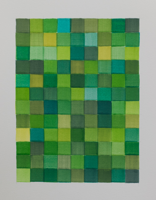
108 combinations or single colours, chosen at random from 120 possible permutations of 15 different greens.
Museums, Art History, Art
108 combinations or single colours, chosen at random from 120 possible permutations of 15 different greens.
The woods don’t look welcoming. Straying off the path, if you can find one, would probably lead you into trouble. The trees look dead, bare branches in the brownish murk. If we went in, what might we find?
A scary monster. Sharp fangs opened wide, eyeless and glossy black. Organic traceries or force fields surround his head. He might bite your hand off unless you can get away. You can almost hear him shrieking. There’s an apelike grey skull, an unearthly green light in its eyes. Is it dead, or somehow alive? An enormous hand is outspread in extreme close up. The hand of what – a man, an alien? The fingertips are coloured, the palm emblazoned with jagged purple symbols. Is it held up in a gesture of welcome, protection, or fear?
Those jagged lines keep coming. An acid yellow-green bolt cuts through a glossy slick of black paint. A black bolt glitters crisply against a matt grey surface. A shard of bright red, edges and point knife-sharp, sears across a cascading flurry of dark brush strokes. Is it rising, or descending? So many questions present themselves in this revel of ambiguity.
There is intense colour amidst the darkness, and it is very dark here. The mood is sombre, yet the work is vivid and dynamic. There’s an energy in the flow of brush marks, with some of the paint surfaces heavily worked. But there’s also an intense precision, a care for things being exactly so. Paint here is partly enjoyed for its own sake, as a liquid held in suspension, as a texture that you want to caress. A surface that glitters, shines and flickers before the eye.
In Arise, a totemic figure crowned with a lightning bolt fills the space before a field of something molten and glowing. Radiating darkness, emerging from an array of jagged shapes, it stands before us. Are we meant to worship, to cower? In the depths of the forest, we might have stumbled across a kind of dark ritual. If we could hear it, the noise would likely be deafening.
Charlie Smith, 336 Old Street, 2nd Floor, London EC1V 9DR.
At the end of this show there is a small display of commercial items (and no, I’m not referring to the gift shop). Photographs of models wearing angular dresses are shown next to a box of tissues and other goods. They are all adorned with Mondrian’s signature style. The black-lined grid on a white ground, punctuated by oblongs of bright primary colours, seemed to lend itself readily to commercial design and advertising. One can only imagine their originator’s despair had he been alive to see it.
The popular idea of Mondrian as a slightly austere creator of refined abstract paintings is reinforced by the photographs taken in his Paris and New York studios of a slim and rather donnish character wrapped in a dark double-breasted suit and wearing round rimmed glasses. If these images taken together comprise a Mondrian myth, then this show sets out to dismantle that myth by emphasising Mondrian’s development from his student days, mostly in terms of his use of colour. This is done, it turns out, almost at the expense of showing his more recognisable mature style. The colour of ‘Mondrian and Colour’ is not limited to his characteristic primaries of red, yellow and blue, but comprises the whole spectrum.
The show begins with numerous landscape sketches, many done plein-air, in naturalistic earthy tones. There’s a delicate study of a birch wood which makes clear what a skilled draughtsman Mondrian was. But fairly early on there are disruptions to a neatly linear narrative, exemplified by a sketch of a willow tree which is in huge contrast to other works in the section. Broad- brushed horizontal lines of orange and green lie beneath a dark silhouette of the tree which is more symbol than naturalistic description.
Another landscape with a river and trees seems to be moving towards Monet’s territory with a bolder but still natural use of colour. But although Mondrian did not abandon the conventions of landscape, still life and portraiture for many years, his palette begin to change radically around 1907. Contact with Goethe’s theory of colour seems to have influenced a series of flower studies and portraits in 1908-10, including a flowing loosely-brushed portrait of a girl with radiantly orange-red hair and a semi-pointillist study of a lily in blue, red and orange.
Mondrian joined the Theosophical society in 1909, and the curators are keen to emphasise Mondrian’s growing spiritual leanings and his slow progress away from naturalism, through symbolism to a fully-fledged abstract style. Those moves become more obvious in a stunning series of paintings of a windmill and churches. The Red Mill of 1911 illustrates the curators’ thesis of his progressive intensification of colour and simplification of forms. Despite the low viewpoint looking up, the space is flattened into planes of intense colour and one is aware primarily of the bold conjunction of red mill with blue sky and earth, with an ultramarine rhombus sitting at the axis of the mill’s red sails.
The sequence of church paintings also illustrates this development. Starting from a relatively naturalistic depiction of a church tower in Zouteland there is a progression via a stunningly colourful church in Zeeland, all bold strokes of red, orange and pink, to a 1911 Domburg church tower. The tower itself is pink and purple, while the green sky is scattered with deep blue polygons, which may or may not be abstracted leaves.
It was in 1911 that Mondrian visited Paris for the first time, moving there a year later. Cubism was by this time already well advanced, and that influence on Mondrian is made clear here. A landscape in muted tones is dominated by the dark lines of a rough grid, and a grid dominates the adjacent abstract painting, an oval dominated by dark lines interspersed with pink, yellow and blue. Oval compositions were by this time part of Braque and Picasso’s repertoire and although many of their paintings are dominated by grids of dark lines, both of them steered clear of outright abstraction. Mondrian here employs the grid and the format but discards any reference to things in this world, using the structure instead as an armature for pure planes of colour. The next painting intensifies the colour further, the almost pastel shades abandoned for an arrangement of intense red, blue and orange rectangles in a checkerboard composition.
This section of show features another disruption in the narrative put forward by the curators. Painted the year before the checkerboard and four years after the oval – both resolutely abstract – is an imposing and naturalistic self portrait painted in similar muted tones to the earlier landscape. Mondrian regards us over his shoulder, with what looks like a newly-begun painting of rectangles sketched in grisaille on the easel behind him. Mondrian may have viewed his development towards abstraction as an evolutionary process, as the introductory text has it, but it was clearly not as linear a progression as the exhibition might have us believe.
For the remainder of the show – and there are only a few paintings here in the immediately recognisable style – abstraction is everything. With the whole of an artist’s work before us the temptation of teleology can be strong and this is not avoided here. Some of the captions urge us to see the use of strong vertical lines in a lighthouse or the depiction of clouds with horizontal brushstrokes as portents of the grid which would later dominate Mondrian’s work. This can seem a little far-fetched at times and the story that the paintings themselves tell is probably typical of many artists: a life’s work of sometimes haphazard experiment under a variety of influences, which eventually matured into a style that gained popular recognition.
Detail: