Rothko/Sugimoto: Dark Paintings and Seascapes

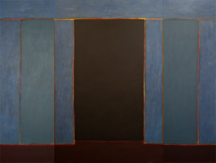
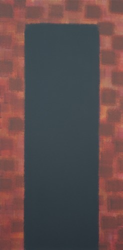
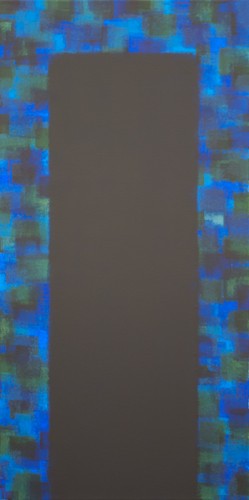
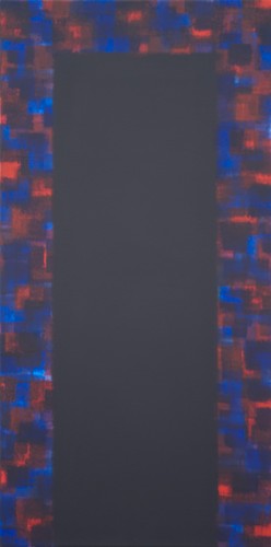
Mark Rothko’s paintings at their best are richly coloured, glowing and with a mysterious depth. Paint handling was at the service of conjuring up this sense of undefined forms floating in a pictorial space – think of the feathered edges of the forms in the Tate’s Seagram murals. Late in his life he chose a palette, materials and paint handling quite different from what had gone before. The paintings at London’s new outpost of the Pace Gallery are in acrylics not oils, and with most of the colour drained out of them. Blacks, greys and dark browns dominate, with one exception in a pinkish mauve and blue combination that provides light relief from the darkness elsewhere in the gallery.

Instead of forms apparently floating in a larger colour field, here the image is divided horizontally into two areas which extend to the edges. Black or brown is above and grey below, occasionally with a rough division between. There is little sense of depth. The black tends to be even and matt, the grey and brown brushed rapidly on with many broad marks. The dominant sense is of a dull flatness; that feeling is enhanced by the loosely taped edges that leave a slightly ragged white border around many of the works. It’s hard to separate the works, painted in the last year of the artist’s life, from the biography. These works are bleak and desolate, as Rothko’s life may well have become before he committed suicide in 1970.

It’s a relief, then, that these paintings are shown in juxtaposition with a selection of Hiroshi Sugimoto’s large-scale seascape photographs. While there are certainly formal affinities between the two sets of work, the contrasts are stark. While the height of Rothko’s ‘horizon’ varies from work to work, Sugimoto places his dead centre every time. The seascapes draw you in, the prolonged exposures softening detail and blurring the horizon – an affinity with Rothko’s feathered brushwork. Looking at an empty sea and sky, an infinite horizon, we are invited into a void and a sense of expansion. But there’s a contrasting force at work, the build-up of light over a long exposure, the light radiating from some of the photographs with the force of a painting by Turner. In one of the two images entitled Bay of Sagami, Atami, the light bulges over the horizon as if breaking through a boundary. At the other end of the scale, a sequence of three images of the Tyyrhenian Sea goes from a pale grey to a deep, satin black. The horizon is invisible and the only differentiation in tone is a subtle darkening at the corners. We have to take it on trust that there was anything in front of the camera, and I’m reminded of Wolfgang Tillmans’ abstract photographs – these too are experiments in light, not depictions in the usual sense. Sugimoto’s greys are smooth and subtly detailed, such as the soft ripples of water visible in Lake Superior, Cascade River. Rothko’s greys seem rather dull by comparison, but the most appealing of the canvases has striations that echo the water that fills Sugimoto’s images.

The radiance and softness of many of the photographs is a direct contrast to the dull blankness of Rothko’s late paintings. Sugimoto is opening up the world; for Rothko it was closing down.

Central Line Series: Art on the Underground

The London Underground is a busy place. It carries an average of 2.7 million passengers per day, many of them jostling for space as they make their way along crowded corridors, wait on platforms and squeeze into often absurdly crowded carriages. All the while they are subject to sensory bombardment: announcements, signs, sound leakage from mp3 players, and of course adverts. There are adverts above the carriage seats, on the platforms, in the corridors, on either side of the escalators and even sometimes on the floor and the ticket barriers. In some stations, posters are giving way to digital displays, heightening the intensity of information. In Kazys Varnelis’ essay on network culture, he comments on the privatisation of public space into a “theatre of consumption under high security and total surveillance”. The tube is one such increasingly privatised public space.

When I first encountered part of the work collectively titled ‘A Lock is a Gate’ at Bethnal Green tube station, it was with both surprise and a sense of relief. Instead of the parade of adverts beside the escalators, there are two long decorative panels. Both show undulating white lines traversing a brightly coloured checkerboard with the appearance of watercolour. The line resembles an audio wave and thus suggests music, words or song. While the pattern repeats along the length of the panels, the line changes as you move, adding a sense of engagement to the piece.

Adverts always want something from you: your time, your attention, and ultimately your money. Their insistence can be tiring, especially when grouped together as they are on the tube. An artwork like that at Bethnal Green, on the other hand, makes no such demands. Here instead is an offering, a gift. It is there to be looked at, and hopefully enjoyed. The work is enriched by the documentation in this book, where you find that it is one of many products of a collaboration between artists and members of a boat club in Hackney. The corporate has here given way to the communal.

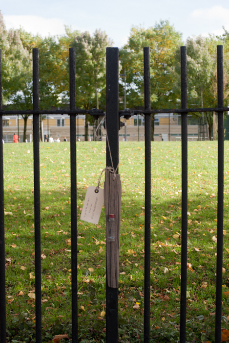
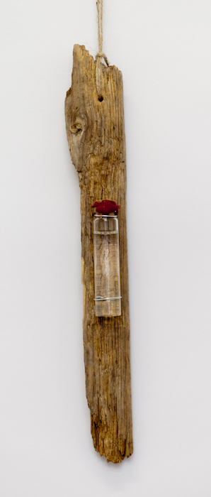
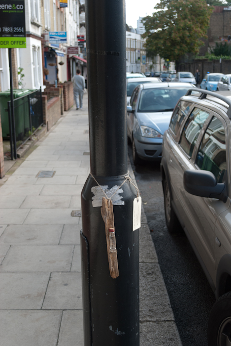
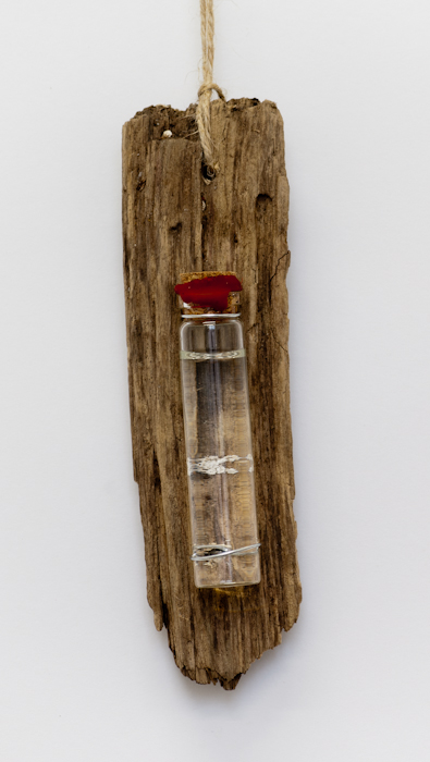
Michael Landy’s ‘Self and Other’ project also explores themes of collaboration and connectedness, however momentary that connection may have been. The tube can be an isolating place, with each person trying to preserve a sense of their own space – even, perhaps, their own self – in a crowded environment. Headphones are frequently worn, with noise cancellation becoming increasingly popular, and eyes are averted from neighbouring passengers. Landy was aware of partaking in this isolation himself, and one day noticed two strangers on the tube, one helping the other. In ‘Self and Other’ he set out to collect stories of this kind of event, stories of kindness, and placed them in various sites: outside stations, on platforms and in carriages. The sample stories collected here are touching and a reminder of how much potential for kindness there is, even amongst people who may be spending most of their journey trying to avoid contact with one another.

Federico Campagna’s essay ‘Community is Dead – Long Live Community’ touches on the same topic in its discussion of the difference between communities which form around an abstraction – the nation state, for example – and those which are formed by individuals responding to one another as individuals, regardless of group identifications. Landy’s stories highlight the possibility of this more spontaneous kind of community.

The enforced communality of the tube carriage, especially on the central line at rush hour, can be an unpleasant experience, with passengers crushed together in unwanted proximity. Alice Channer’s work introduces physicality into the tube environment in a more allusive way. Taking impressions of elastic waistbands, she assembled numerous prints of them into long friezes lining the escalators at Notting Hill Gate. The looped forms, dispersed in different groupings along the white frieze, echo the passage of individuals up and down the escalators. As with Landy’s stories, they are a reminder of the individual in what is often an impersonal environment.

Central Line Series documents five projects including the three I’ve mentioned here. This slim and well-produced volume is a valuable reminder of how much can be achieved by public art projects when they are executed with flair and imagination.