If you’ve spent much time looking at paintings, you may have noticed they can change their appearance. A clear and well-defined image seen from a distance can alter as you move closer, revealing itself as a mess of brushstrokes.
Velazquez’s portrait of Prince Philip of Spain, for instance, which hangs in London’s National Gallery. The prince wears a richly embroidered silver-brown jacket. Every detail of the embroidery seems carefully picked out by the painter’s brush. Move closer though, and that fine detail dissolves into dots and squiggles of paint. From further away, an image. Close up, just patterns of paint.

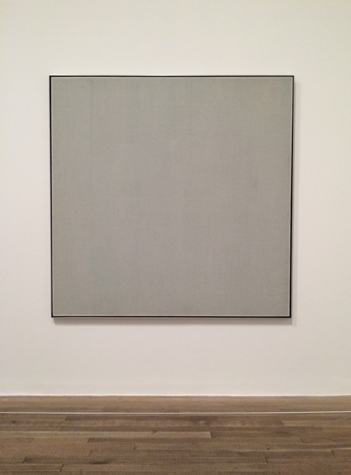
That effect can also work the opposite way. When you first see this painting by Agnes Martin on a wall on the far side of the room, it appears to be no more than a monochrome. Most of the six-foot square canvas is a blue-grey square, with a very narrow border of lighter grey on all four sides. There’s some variation in the large blue-grey square, a kind of cloudiness, but otherwise it seems monochromatic: just a large square, its colour reminiscent of faded denim, filling most of a lighter background.
As you move closer, the painting changes. A fine grid of lines starts to appear. The lines are not clear everywhere, but faint horizontals and verticals can be made out, evenly and tightly spaced across the surface.
Move closer still. Maybe you are only three or four feet away, close enough to see the details clearly. The fine grid now appears to be incised into the paint surface. The grid lines are unevenly coloured along their length, varying from pale cream to dark grey. Perhaps the cream colour is the canvas, revealed by the line cutting through the paint. It’s not clear. But what you can see clearly is that the grid divides the blue-grey square into an array of tiny rectangles. Each one is probably no more than half a centimetre high and perhaps a centimetre wide: tiny compared to the size of the whole grid. Inside each rectangular cell is a small stroke of grey-blue paint. The rounded ends of a stroke sometimes cross the grid lines on the left or right, occasionally touching the stroke in the next cell. Stepping back for a moment, you realise that it’s this variation – some brushstrokes touching, some staying within their cells – that causes the cloudy effect you noticed when you first saw the painting from a distance.
Seeing all this, you might start to wonder about the work involved, the concentration required. You might wonder how many grid lines there are and how many tiny cells the grid contains. You might even try to count them, as I did. Scanning along the bottom row, from left to right, I counted 214 cells. They are wider than they are high, so I guessed that there might be as many as three or four hundred cells from top to bottom. If three hundred, then there are over 60,000 cells in the whole grid, each one filled with a little stroke of paint. The attention and patience required to make this painting begin to seem intense. What kind of person spends their time ruling a grid of over five hundred lines and filling each cell of that grid with a stroke of paint? They would have been standing closer to the painting than you are now, ruling every line, then probably working their way from top to bottom, left to right, painting every brush stroke until every cell was filled. Agnes Martin made this painting in 1963. She painted others like it, and many subsequent paintings were much simpler, sometimes featuring just a few horizontal pencil lines and wide bands of thin, translucent paint. But whether simple or complex, in most of her work she continued to draw and paint grids and stripes of colour on square canvases for over forty years.
Agnes Martin is at Tate Modern until 11th October 2015.